Background information
Organization name
Spruce up a small subsection of our website - turn the boring bullet list into something more visually engaging
Description of the organization and its target audience
We sell a stretch mark cream called SkinVectors. It is an advanced cream that has been clinically researched and offers more active ingredients than any competing product. In an effort to rise above the "hypey" products, we spent a lot on R&D and also made sure our website reflected that clinical feel.
However, we have a subsection on the site that we need redesigned.
The website is http://www.SkinVectors.com and the subsection we need designed is called "Why SkinVectors Is Different"
It is the subsection above the Success Stories section: https://www.skinvectors.com//#successstories
We've also uploaded an image of the section here (existing_section.jpg)
You'll notice that this section has 10 bullet points. Each one of these bullet points is an important feature of the product and we don't feel that just having a long bullet list in plain text does it justice. Each one of those bullet points reflects years of hard work and tens of thousands spent on research.
So designers, here's what we want:
We would like you to redesign this section. Keep the headline of the section the same "Why SkinVectors Is Different" so that it doesn't break from the existing design of the site. However, put the rest of the section in a more visually engaging form.
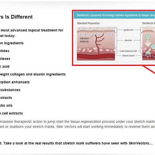
The text above and below the bullet points can remain plain or you could spice that up as well. You can delete the "lipsomal technology" image (see attached image.
The design can be minimalistic or involved but remember to keep it clean.
Industry
Cosmetics & Beauty
Primary objective of the landing page
To convince the buyer this is a genuinely product that is well researched and works
Existing website
Visual style
Style/theme ideas
Stick with the existing theme of the website. You are free to use any colors that are bright and complement the website's existing colors.One idea that we like is to possibly put the product in the middle with the features circled around it with sharp lines pointed towards the bottle.
See included links for design inspiration.
Inspirational websites
https://d13yacurqjgara.cloudfront.net/users/14521/screenshots/1065960/pie_chart_1x.png
http://ih.constantcontact.com/fs051/1102441261489/img/92.jpg?a=1103035586255
http://7428.net/wp-content/uploads/2014/07/Infographic-Color-Pie-Chart-Vector.jpg
http://chartporn.org/wp-content/uploads/2011/04/image13.png
http://download.4-designer.com/files/20140827/Flower-3791.jpg
Content details
Elements to include in the landing page
We want to keep the content the same as it is now. Just want it to be more visually beautiful.
Contest deliverables
Digital design
Final files
If you use fonts that require a license, confirm with the client they're ok with it. For licensing reasons, it is better to provide your client with information on how to acquire the font rather than providing the actual files.