Background information
Organization name
Shayes Apps
Industry
Technology
Description of the organization and its target audience
We sell mobile applications to a wide variety of customers on Apple platforms.
Content details
Description
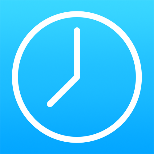
Modernize the Countdowns mobile app icon. The app icon is a little dated and not consistent with the current iOS design styles.
The new icon should be similar to the old one so not to confuse users but feel more at home and modern on users devices. Please keep the blue color scheme and the concept of a clock icon. It can look the same but with more dimension/less flat
The icon will be used on iOS, macOS, and watchOS so needs to work great across those OSes.
References
Other notes
The current logo is attached. Feel free to look at the app on the App Store: https://apps.apple.com/app/apple-st…d917514700
Contest deliverables
1 x Digital design
Final files
If you use fonts that require a license, confirm with the client they're ok with it. For licensing reasons, it is better to provide your client with information on how to acquire the font rather than providing the actual files.