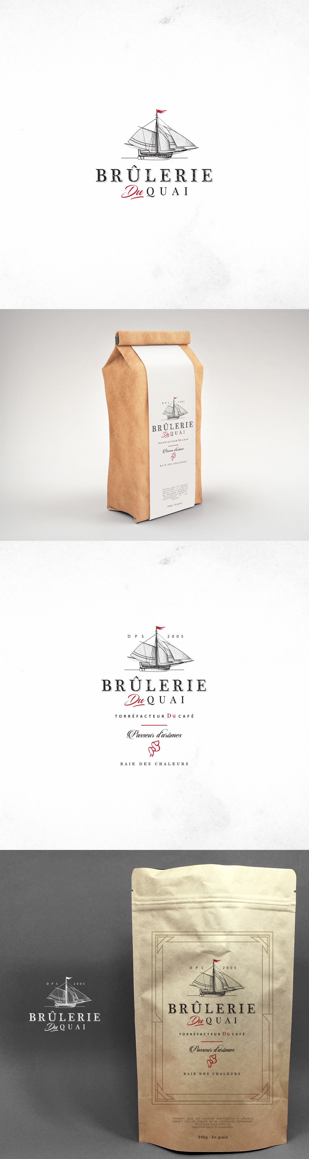

Inspired by the maritime history and artisanal roots of coffee roasting, the Brûlerie du Quai logo features a finely illustrated vintage sailing ship. This element evokes exploration and craftsmanship, perfectly aligning with the brand’s identity as a small-batch, quality-focused roastery.
The serif typeface and selective use of red provide an elegant contrast, bringing sophistication and warmth to the visual identity. The logo is versatile and maintains strong visual impact across both minimal packaging and detailed label compositions.
This branding solution was crafted to convey authenticity, legacy, and sensory richness. It positions the product as both premium and approachable, while celebrating local heritage and storytelling through design.