
Created on 99designs by Vista
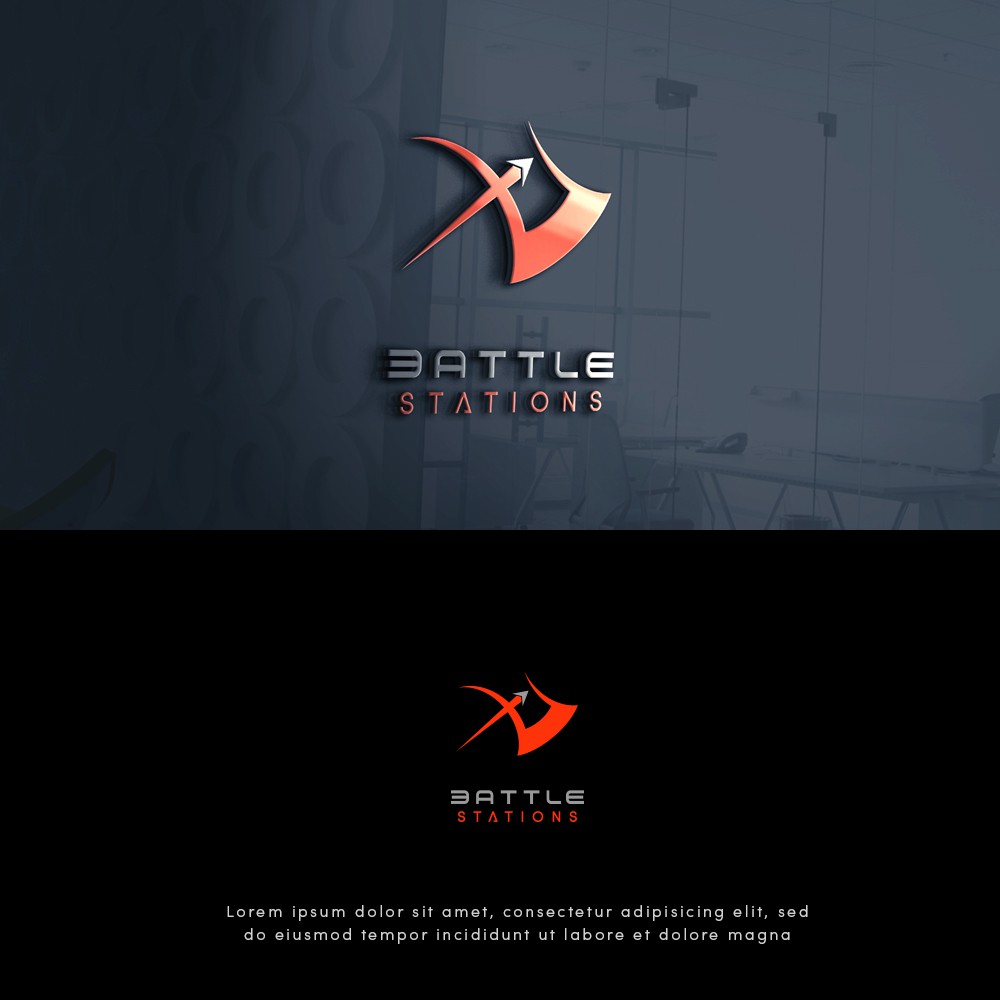
Bow and arrow merge with an axe made the look of this logo more bad-ass which the client likes.
Letter B and E of the word BATTLE are also customized to give a balance look of the text - that matches the first and last letter S of the word STATIONS.