
Created on 99designs by Vista
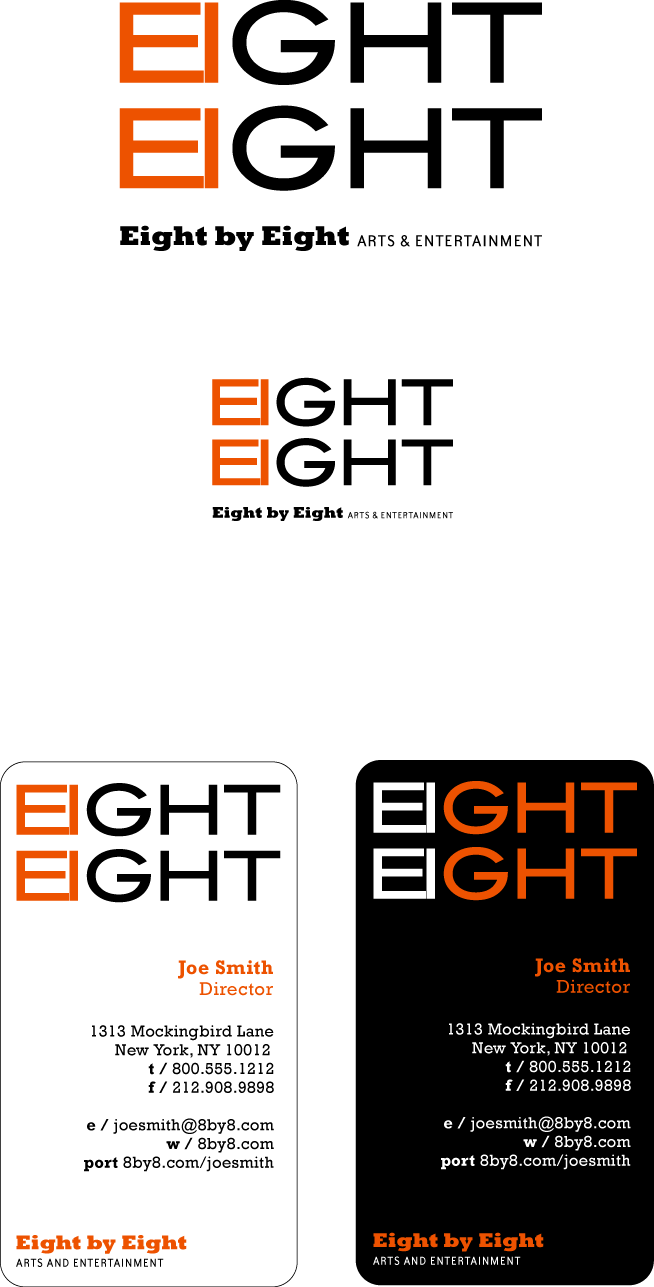
I submitted many variations of the "8x8" concept, but when I began playing with the kerning of a simple type treatment using the two words it was exciting to see the E and I combined create an 8. My favorite logos have always been the ones that were more subtle but also smart and unique. This was my goal with this logo and I felt I achieved that here.