Cover design for REwild Magazine

3
Created on 99designs by Vista
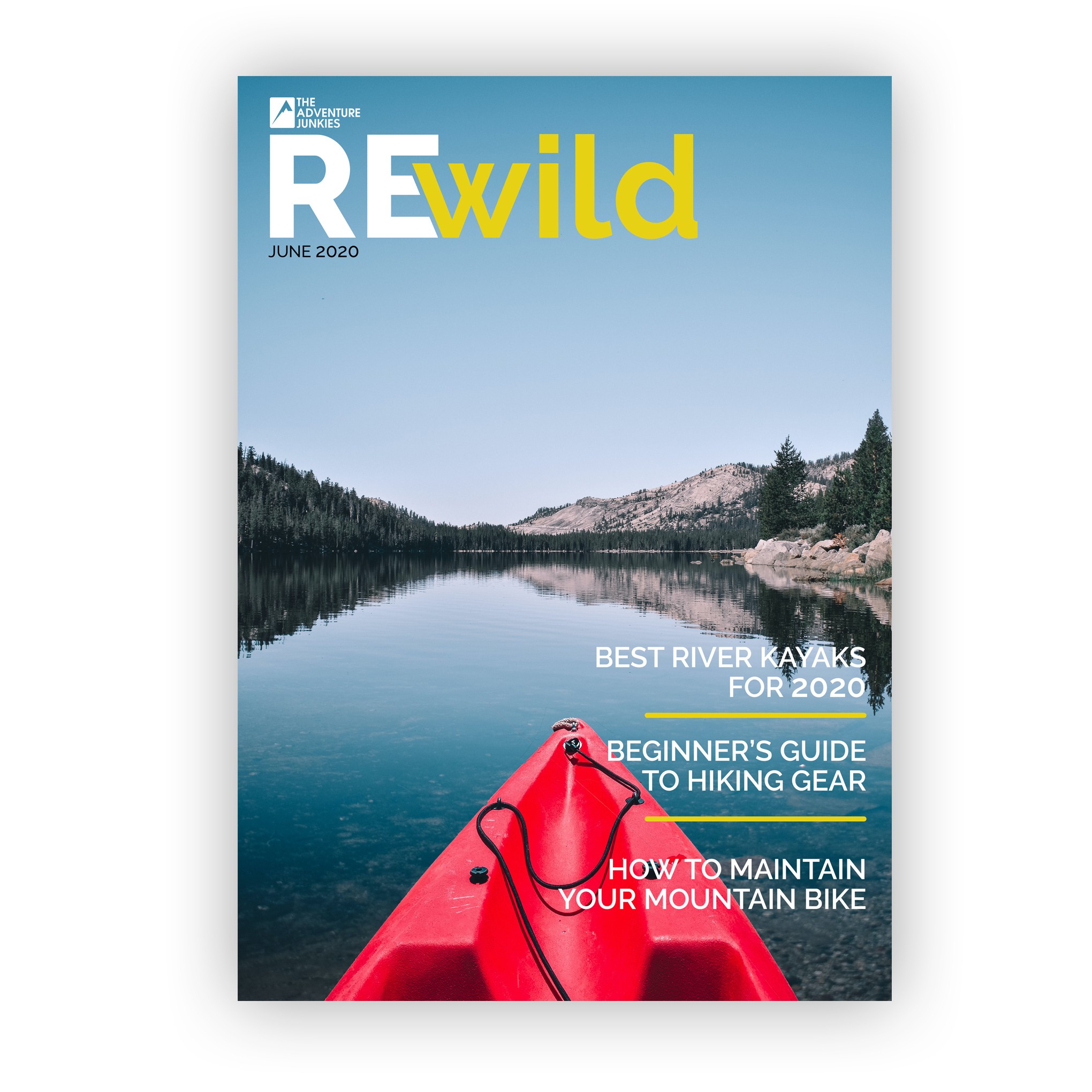
Client is looking for a design for their new outdoor magazine. Their current website has a clean style and the desire is to carry that into the magazine cover as well.
The masthead is created to layer over the cover imagery which will allow the beautiful outdoor photography to be featured without too many distractions.
The title is a simple san serif font, the words are separated by using different color and font weights. The 'e' shape is cut out to match the angle of the 'w' in wild. This gives the title their unique style and allows the two words to move together seamlessly.
Article titles are in a lighter weight of the same font and divided by a rounded end line in the same color as the masthead to tie them together