
Created on 99designs by Vista
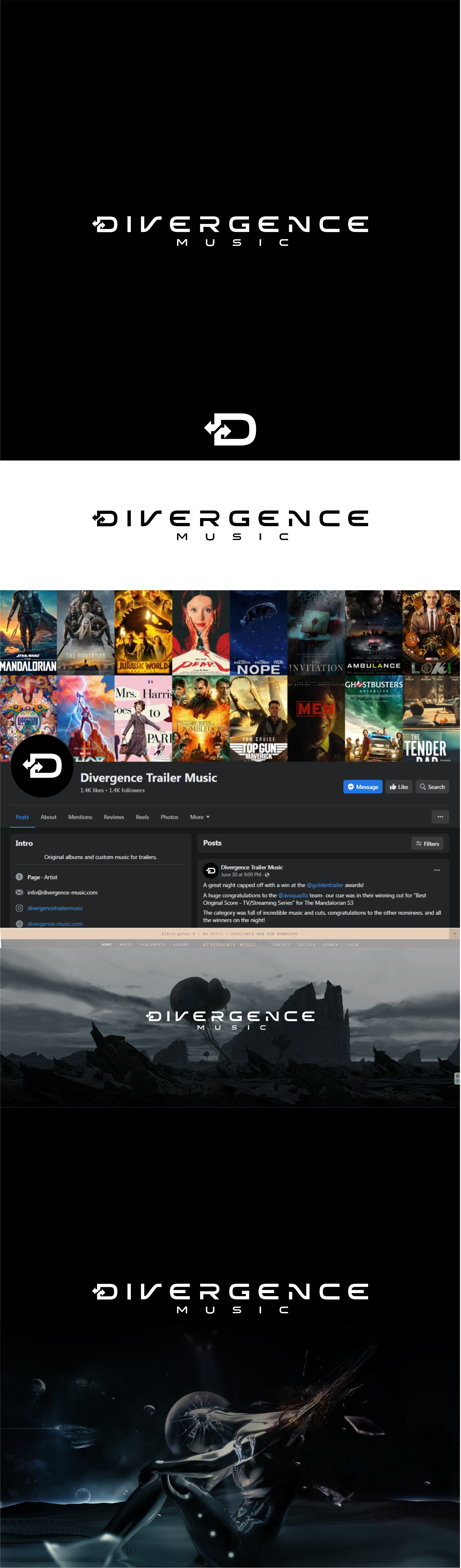
Logo for a boutique trailer music company, providing music and sound design to trailer companies that specialize in large budget TV, Film and Video Game trailers.
They wanted something bold, clean and modern, a typography design of the company name, “Divergence Music”.
Their old logo used arrows, so I tried to use arrows, but using minimalistic and clean design style and the letter D can be used stand alone.
Also I tried to play with the V and the N making similar and symmetric shapes for them since the two letters are placed in symmetrical positions in the name.
Overall, a nice and modern design.