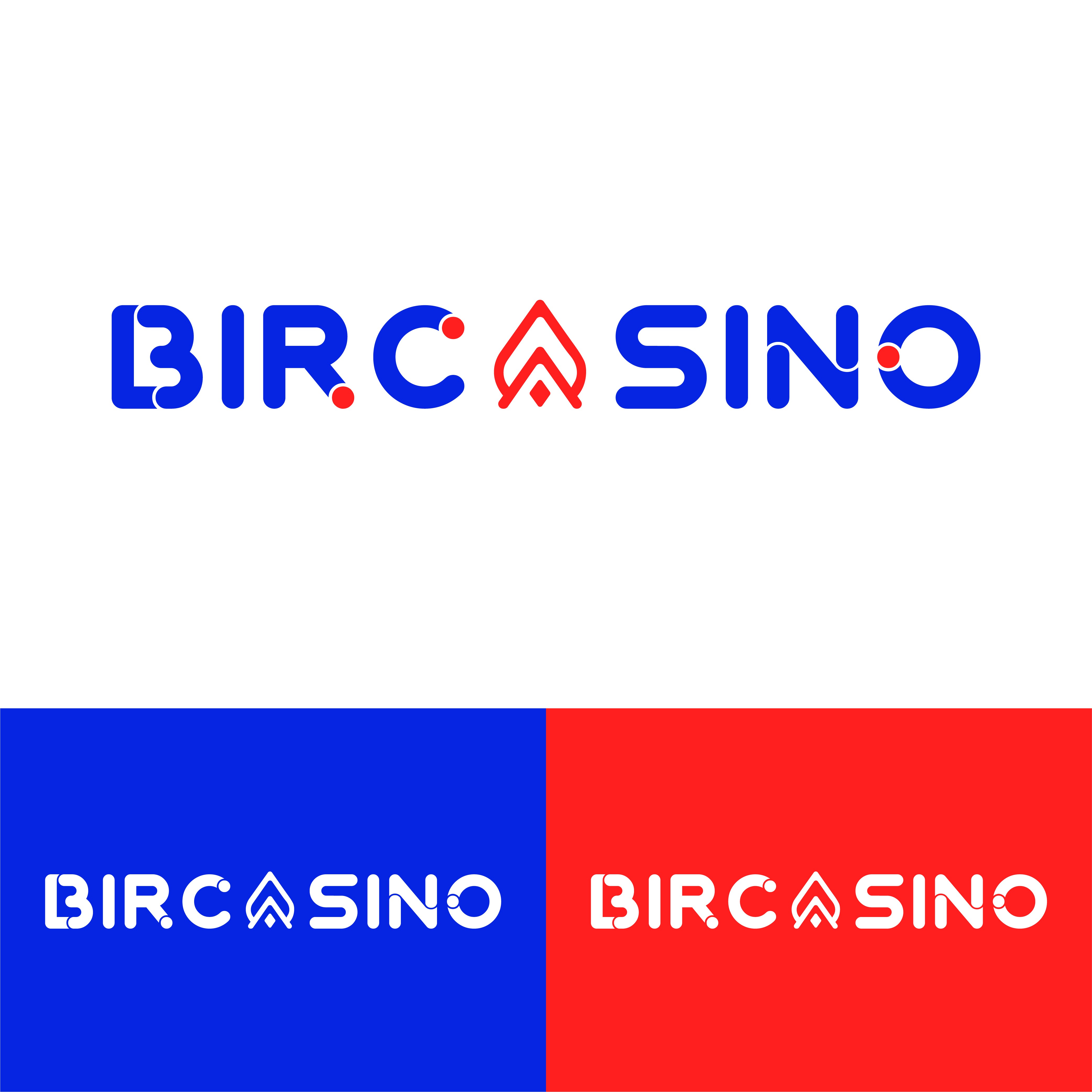

✅Meaning:
The logo integrates a spade icon into the "A," symbolizing card games and the casino industry. The red and blue palette conveys excitement and trustworthiness, creating a balance of fun and credibility.
✅Design Process:
After understanding the client's target audience, I researched casino branding trends. I developed several concepts before refining the design to incorporate the spade icon. The font was chosen for its bold and modern feel.
✅Result:
The logo successfully captures the essence of an online casino, standing out in a competitive market while appealing to a younger, tech-savvy audience.