Web design lives at the intersection of form and function. It makes sense, therefore, that web design trends are heavily influenced by technology, be it the types of devices we use, their processing power, the sophistication of our browsers or the programing libraries available to us. But they’re also impacted by design principals and philosophies.
>> Check out our newest web design trends roundup here
The past few years have given us several technological shifts and advances, including:
- the rising popularity of mobile devices;
- the introduction of native, in-browser 3D support (via WebGL);
- the adoption of HTML5, CSS3 and the rise of front end javascript frameworks;
- and increased network bandwidth (both on mobile and home internet).
These technologies have combined to create a huge shift in the web design paradigm, creating, most notably, a responsive (or increasingly mobile-first) design philosophy.
On the aesthetic side, 3 years ago flat design reigned supreme. And then Google introduced Material design, which brought us slightly out of abstraction. 2017 marks the year design takes one more step back into reality. Whether it’s through form, color choice or functionality, 2017 is a year of hybrids, where reality and technology collide to create a seamless browsing experience.
Here are the 9 web design trends we think are going to bridge that gap:
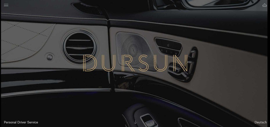
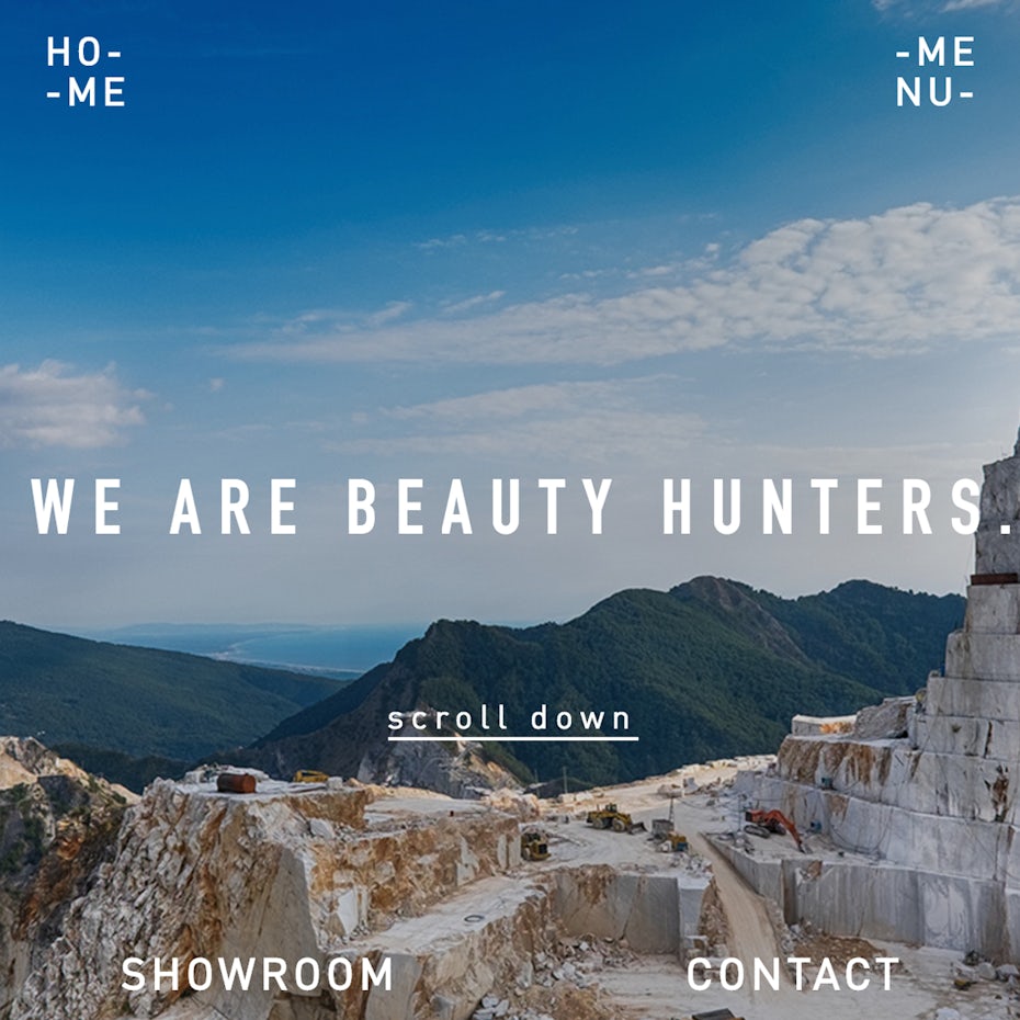
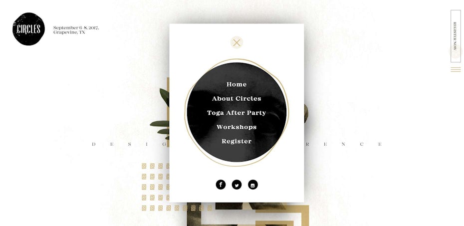
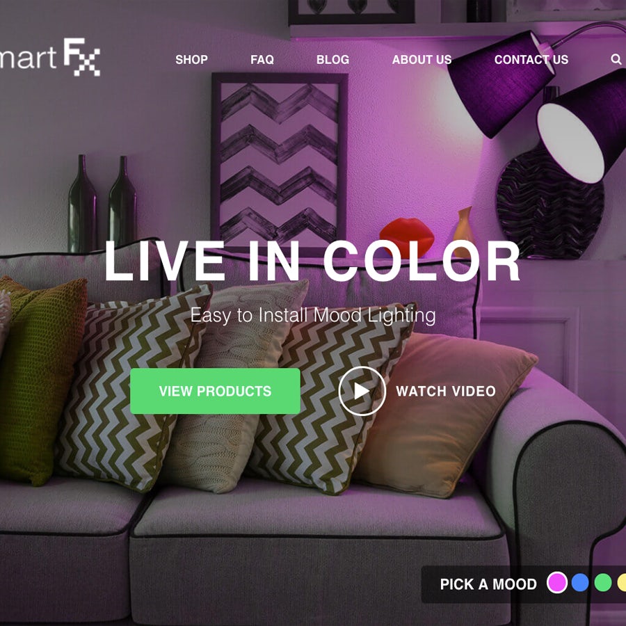
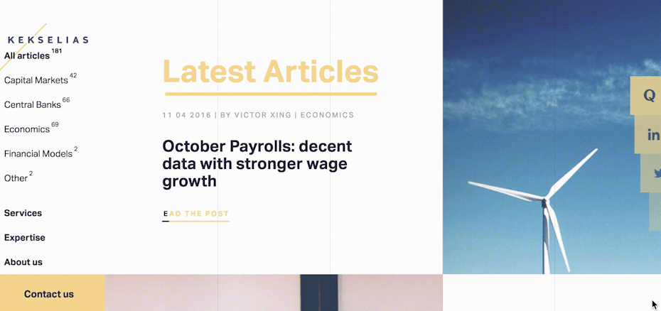
1. Menus that defy navigation paradigms
—
Since dark ages of web design (i.e. 20 years ago) there have been two standard types of navigation: top and sidebar. With the rise of responsive web design, we’ve seen the addition of the hamburger menu to this short list. The hamburger is a workable solution for mobile, but it’s not perfect. It’s been accused of:
- hindering user engagement;
- having low discoverability;
- being less efficient (both for users and design/development teams);
- and even of “having no smell.”
With these sorts of mixed, ambivalent feelings, and the continued rise of mobile browsing, we expect to see a lot of menu experimentation in 2017. Here are a few ways to buck the burger trend:
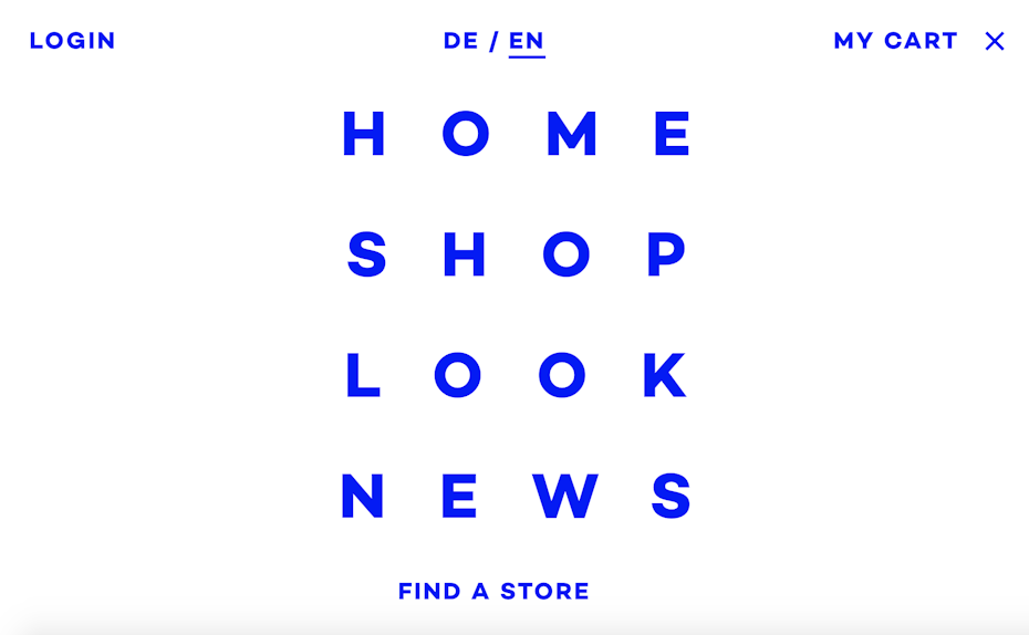
Make your menu a frame
Don’t use a menu at all
Users don’t have to be told what to do on websites anymore; they understand the action of scrolling and will naturally do so until they find what they want. Some designers are choosing to ditch the menu almost entirely and allowing users to find content organically as they explore. With mobile and tablet becoming more popular, this also opens up opportunities for side scrolling.
Embrace the hamburger and make it the only way to navigate
Rather than design two different menus, one for desktop and the other for mobile browsing, many sites are opting to make the hamburger ubiquitous. Since people are learning those three little lines = menu, there’s no need to take up screen real estate with an actual navigation bar anymore. Of course, you don’t have to use the actual hamburger icon. We’re also seeing designers start to play with typography to indicate where a user should click to access the menu.
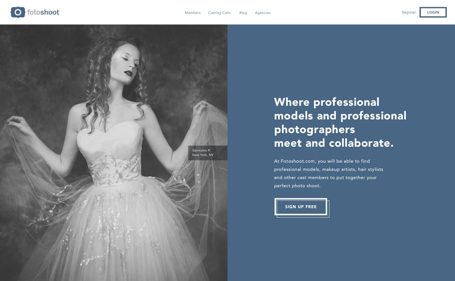
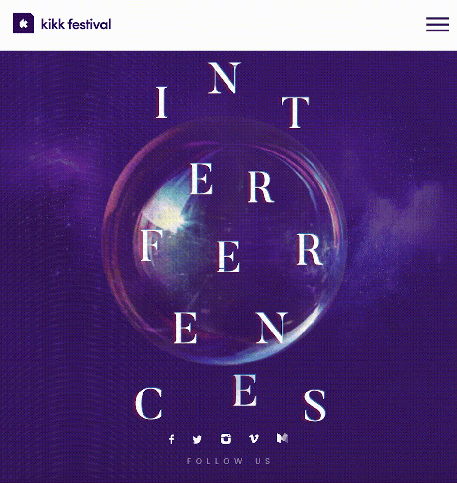
Pop the menu up
We’ve been so blinded by the “drop-down” paradigm that we’ve failed to explore a simple alternative: navigation that pops up! (Or, as is the case in this example, pops to the middle of the screen.) There are lots of places to place a menu that make it visible and accessible that aren’t necessarily top-down.
Or pop it over
A variation of popup navigation is the “popover,” which covers the entire page with the navigation. It’s bold, but still feels natural. It’s a bit of a callback to table of contents sections in print publications.
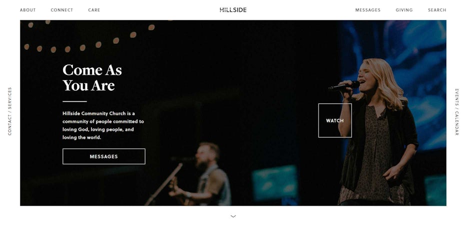
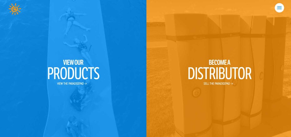
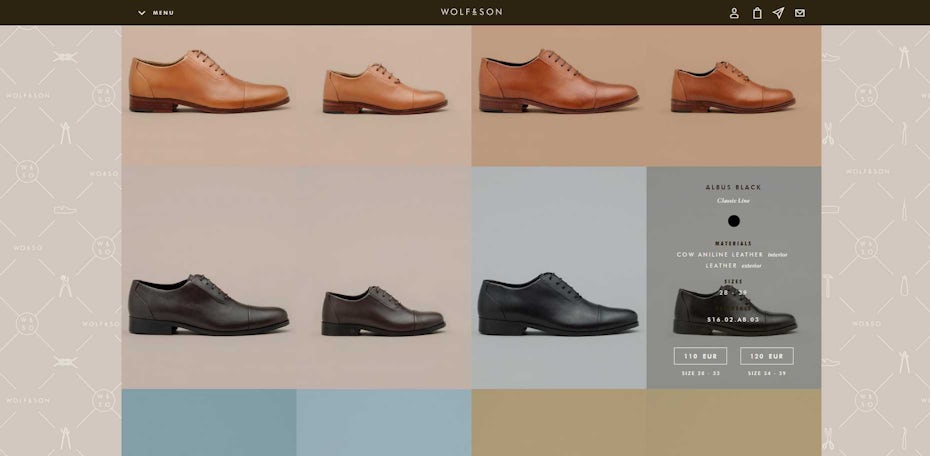
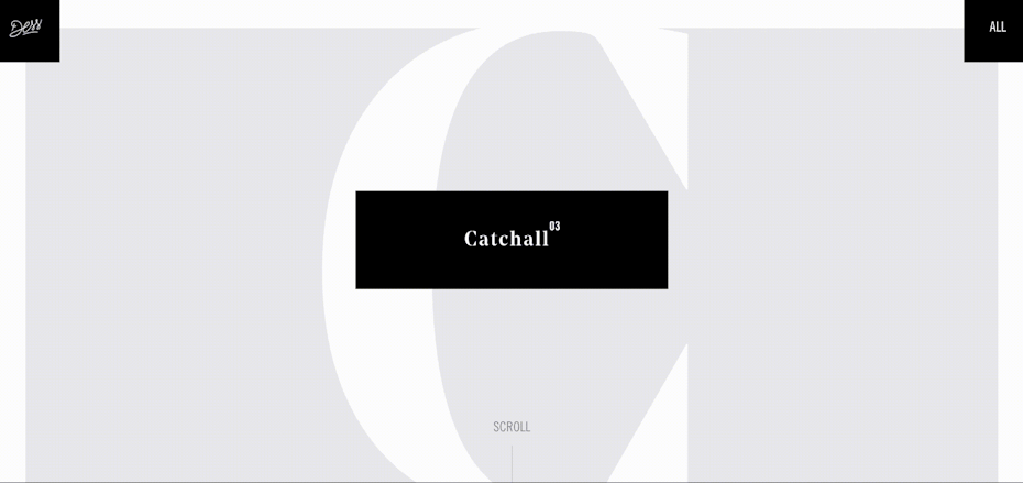
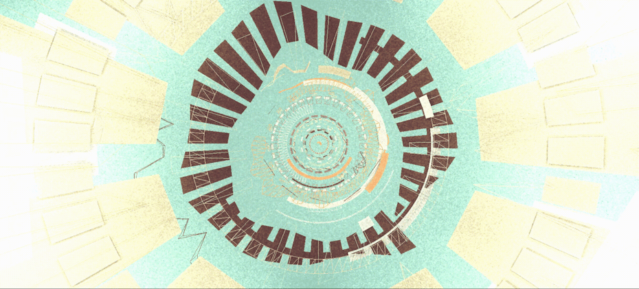
2. Split screens
—
Vertical division of the screen in two equal parts, with clear visual separation, is something we expect to see a lot more of in 2017. This is a visually-striking trend that invokes an open book and gives the site a natural feel. The trend is also quite versatile; on smaller monitors/devices, the two sections can be stacked as consecutive blocks or turned into side-panel navigation.
3. Color with a vintage quality
—
For the past couple years the web has been dominated by gray: light gray backgrounds instead of white, slate gray text instead of black, and subtle gray shadows to create depth in material design. With 2017 we’re finally seeing the return of colors! And it’s back with a vengeance, with bright, vintage hues.
Choosing colors for a website is complicated and can be influenced by many factors, including existing corporate identity, industry, color psychology and personal taste. Whether you decide you like blue, or are more drawn to orange, just imagine running the colors you pick through an Instagram filter to create a warm, nostalgic feel.
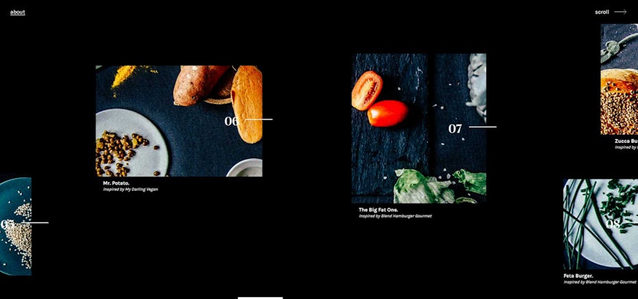
4. Custom scrolling
—
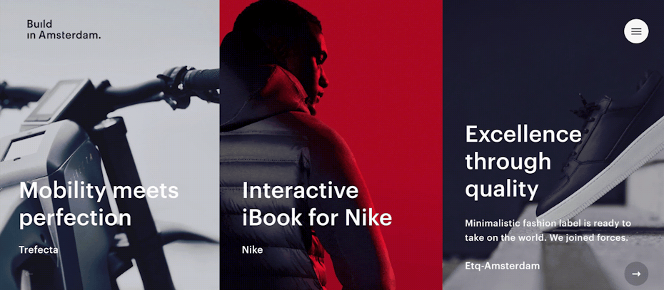
We’re seeing a clear trend of sites ditching the traditional browser scrollbar and instead creating a custom on-page experience for their content. Some sites use “virtual scroll,” which still allows users to scroll, but does it in-app instead of giving the browser control. This allows for varied types of scrolling, like the Build in Amsterdam site, which is designed around horizontal scroll, but can be controlled with a standard mouse; scrolling up and down shifts the content left and right, taking the mobile or tablet experience onto the desktop.
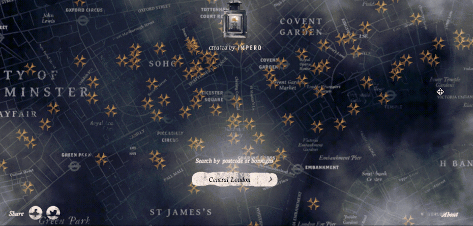
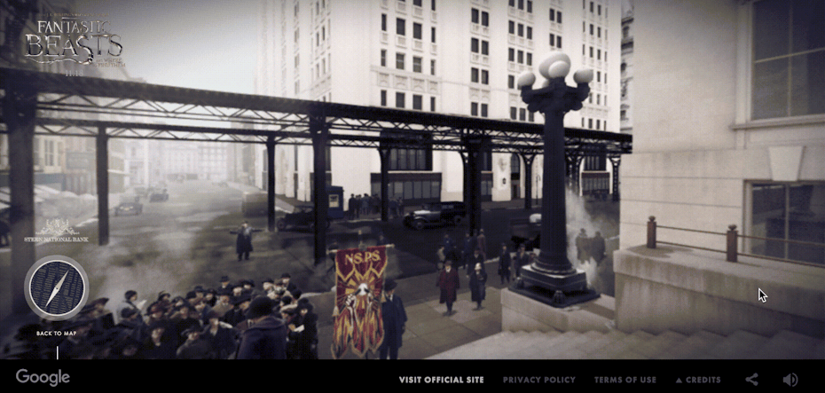
Other sites have done a way with scrolling in favor of the click-drag-and-explore style of navigation. Both Grim London and Magic in New York give users a map, and allow them to physically drag the image to find what they want, ostensibly putting scrolling in users’ hands. Instead of relying on traditional navigation, users then click images dispersed on the map to learn more.
Almost all of these sites use some kind of WebGL application to create and display their content. Grim London is a particularly creative technical implementation: a custom map engine built on top of PixiJS (a javascript 2D WebGL engine).
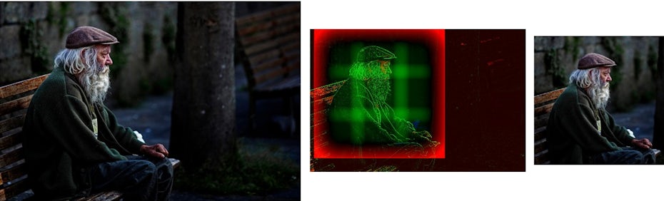
5. Blending tactile with digital
—
Three years ago, flat design gave way to material design, which adds shadows and gradients to still-flat iconography, giving the illusion of 3 dimensional space on a flat screen. This year we’re going one more step back into realism. That being said, we’re not returning to skeuomorphism—which imitates the physical world in digital spaces—either. 2017 is all about seamlessly blending the physical, tangible, tactile world with the digital one.
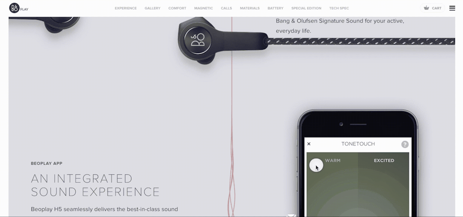
Instead of boxing photographic elements into distinct rectangles—ostensibly creating a window from a screen into the ‘real’ world—objects are being cut out of their settings and dropped into stark digital landscapes. They’re allowed to keep their light and shadows—and therefore their 3-dimensional essences—but they no longer have to play by the rules of reality, either. Objects don’t have to be realistically sized—a book could be as big as a truck—and they can interact with digital elements. Take a look at the Beoplay site: it makes its headphones larger-than-life, then allows them to interact with animated digital lines that visualize sound.
Integrating physical objects into a digital space blurs the lines between what’s on our screens and in our worlds. This, in turn, builds an emotional connection with the imagery on our devices.
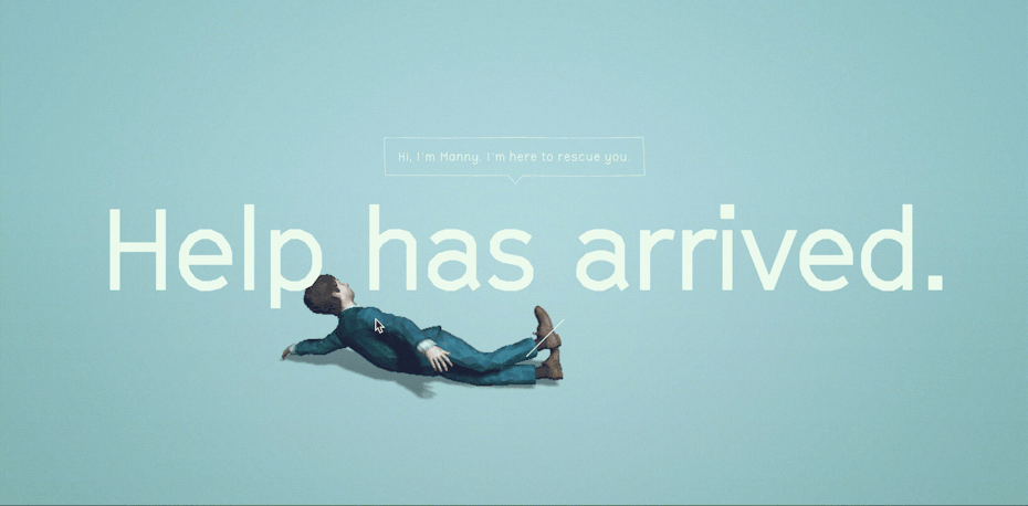
6. Subtle animation and micro-interactions
—
Movement attracts our attention—it’s a result of human evolution. Big, sudden movements, in particular, can warn us of danger. On the other hand, small, fluid movement signifies life. Keep this knowledge at the back of your head as you look to bring movement into your web design. Something huge and in-your-face could be overwhelming and distracting to the viewer. But something subtle could give your design an organic feel.
For years we’ve been seeing animation used to ‘reward’ a user for an action. For example, something moves on hover or on click interactions. Recently, however, we’re seeing subtle animation integrated into pages as a design element, used to draw the viewer’s attention. In particular, we’ve been sing a lot of waypoints, which allow events to trigger as a user scrolls down a page, meaning we can get people to look exactly where we want them to.
Whether they’re implemented through javascript or CSS, micro-interactions not only serve a UX purpose, but also give a site a personality.
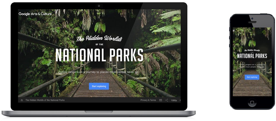
7. Abandonment of aspect ratios in favor of art direction
—
Something short and wide will look great on a Retina cinema display, but completely out of place on a vertically-held cell phone. And composition is one of the fundamental elements of design. So how do you wrangle a responsive universe, where content is displayed on screens and browsers with an infinite combination of aspect ratios? You’ve gotta crop. But how do you do so in a way that maintains design integrity. Enter: digital art direction.
Recently, we’ve seen a number of tools pop up that allow us to consciously and intelligently control composition while ditching the traditional failings of auto-cropping. This leads to a shift in thinking; instead of thinking about content as static images, we should be thinking about it as subject matter. What is the story you’re trying to tell with your images? Emphasize that, and then allow users control over the display.
Some websites, have chosen to completely ignore aspect ratio and have given the power of composition to the viewer. The Hidden World of the National Parks uses a full-background video—this is also the primary content of the site—that stretches to the edges of your browser no matter what shape you make it.
8. Cinematic experiences
—
Big, cinematic video backgrounds started to trend in 2015. They’ve becoming increasingly more popular, however, as technology improves, allowing for faster video loading times. Advances in WebGL have also allow these backgrounds to become interactive, creating immersive cinematic experiences on the web.
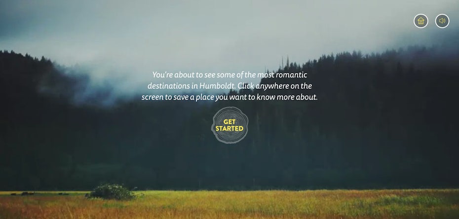
On the other side of things, the cinema experience has been downsized, with small video elements being used to give life to a page, engaging viewers in a more subtle fashion.
9. Gamification
—
Gamification is the “application of game-design elements and game principles [to] non-game contexts,” with the aim of increasing user engagement. In other words: do you want people to remember your site? How about explore deeper into it? Make it fun!
A great example of gamification is the WebGL powered website for the movie Swiss Army Man. The 3D elements on this page are not just some random cool effects. You get a rigged character at your disposal to throw through a space designed with gravity and physics (including fluid mechanics) in mind. (You can also make him do other, more fart-based things, if you’re into that.)
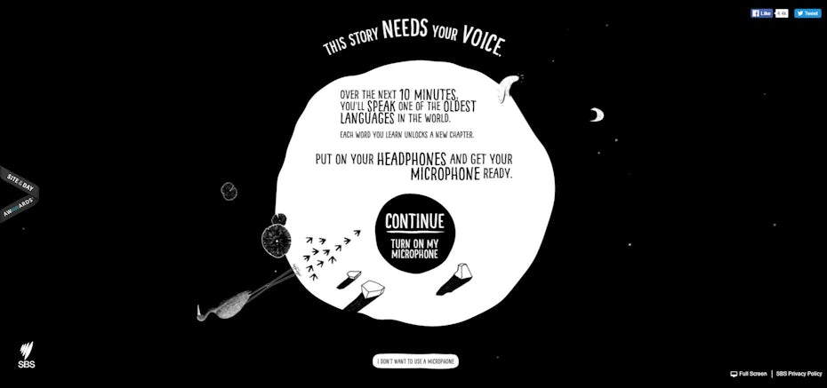
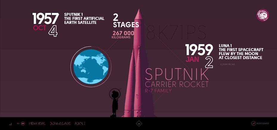
Other websites are using gamification to teach their users new languages, or to educate them in space history.
2017 promises to be an exciting year in web design, as digital design trends start to adopt a more tactile, ‘real world’ feel.